Duration: July-Sept 2022
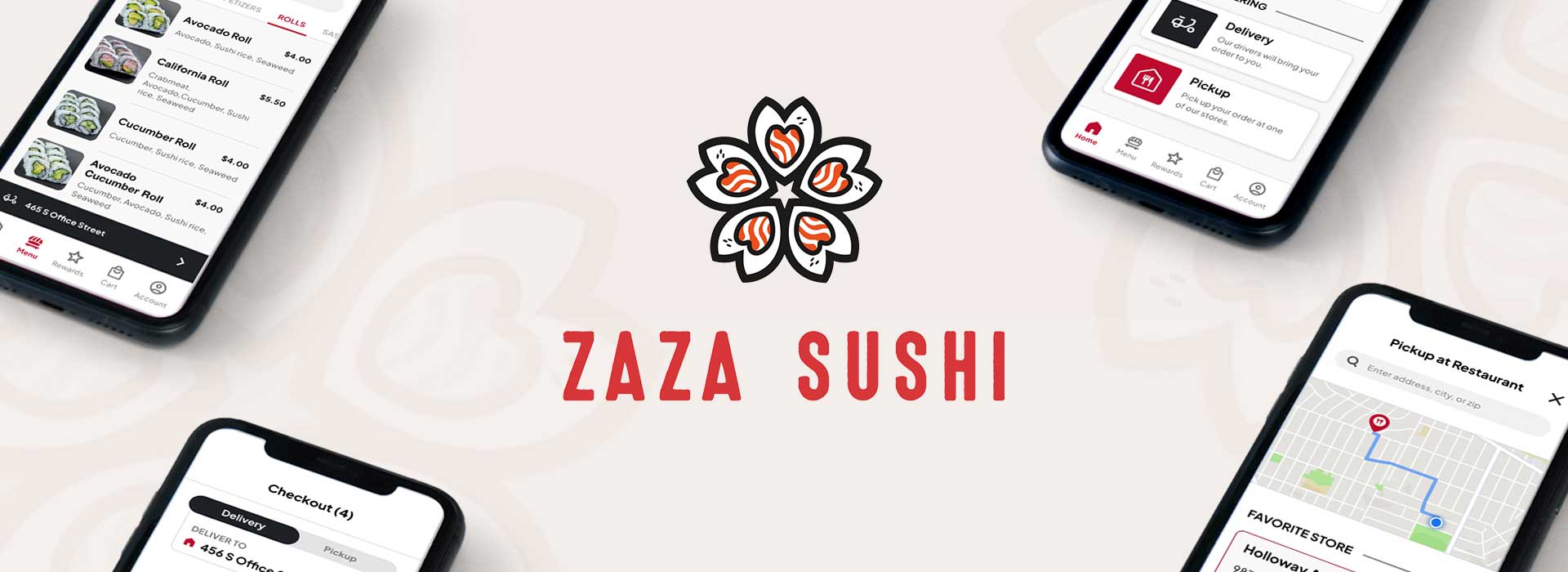
This product is a mobile-ordering app for a made-up sushi restaurant called Zaza Sushi, a Japanese sushi restaurant located in the metropolitan areas targeting customers and busy working adults who order from restaurants at least once a week. The Zaza Sushi app offers a delivery or pickup service for users to easily order Japanese sushi dishes at their convenience.
UX Designer
Conducting interviews, competitor audits, paper and digital wireframes, low and high-fidelity prototypes, conducting usability tests, accounting for accessibility, and iterating on designs.
Busy working adults with unpredictable schedules have little to no time preparing their meals and/or tend to miss meals due to work.
Design a mobile-ordering app for a sushi restaurant that allows users to save time by quickly and easily placing orders in advance for pickup or delivery.
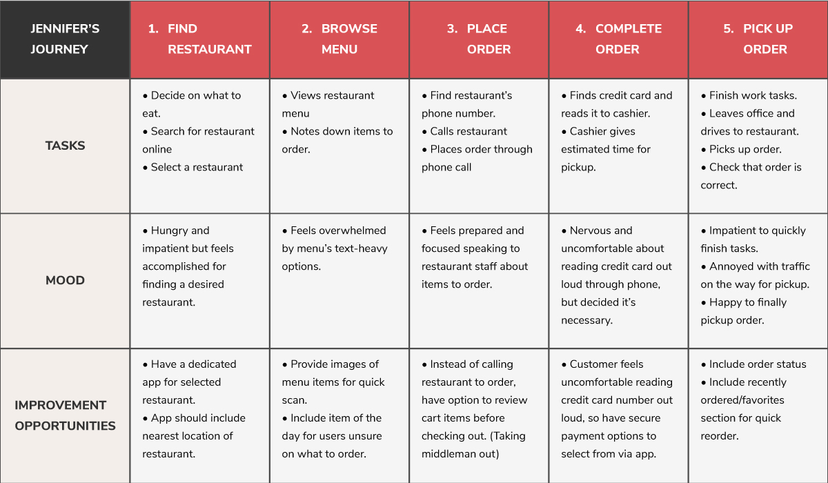
I conducted interviews and created empathy maps to understand the users I’m designing for and their needs. One of many questions I had was what motivated the users to order meals from restaurants. A primary user group identified through research was working adults who don’t have time to cook meals nor dine in at a restaurant.
This user group confirmed initial assumptions such as not having time to meal prep their own food, but research also revealed that time was not the only factor limiting users from cooking at home. Other user problems included obligations, hobbies, or physical challenges that make it difficult to get groceries for cooking or go to restaurants in-person.
Based on my user research and interviews, some key pain points include:
Working adults with busy or unpredictable schedules do not have time to meal prep or dine-in at restaurants.
Platforms for ordering food are not equipped with assistive technologies.
Lack of images and text-heavy menu in apps are often difficult to read and order from.

“I would like there to be an easier way to order food and be health-conscious.”
Name: Jennifer
Age: 39
Education: Medical School
Location: San Francisco, California
Family: Son, Husband
Occupation: Gynecologist
Jennifer is a gynecologist working at a women’s clinic with unpredictable appointments every week. When work gets busy she sometimes misses breakfast or takes a late lunch. On her free time, she enjoys playing tennis to stay physically active and healthy. Jennifer has a mild visual impairment, making it difficult to quickly read text and process information in fast-paced settings. So, she wishes for an easier way to order food.
Jennifer is a busy working adult with an unpredictable schedule who needs a quick and efficient way to order and pick up meals because she doesn’t have time to plan nor cook her own meals.
Mapping Jennifer’s user journey revealed how helpful it would be for users to have access to a dedicated Zaza Sushi’s app to save time and feel comfortable with placing an order securely.
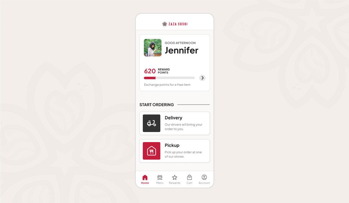
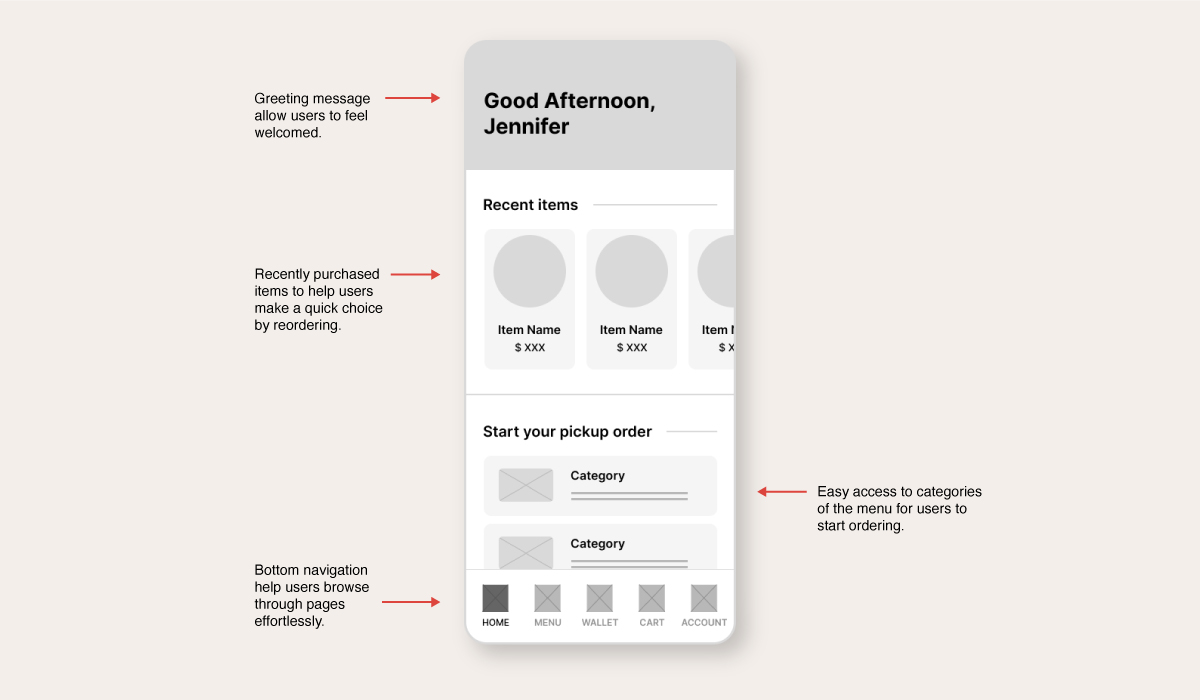
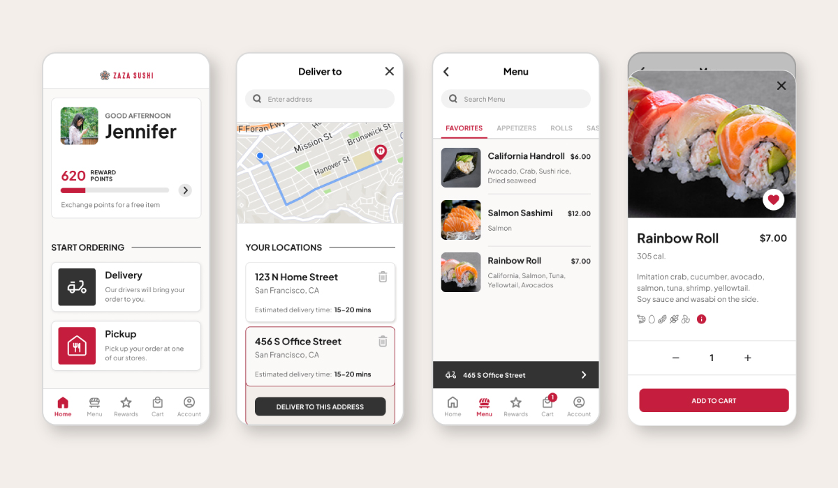
I made iterations for each screen of the app prioritizing on making the ordering process quick and easy for the user. For the homepage, I focused on the user having one less step to the checkout by including the menu categories. I wanted to make the app feel more personalized for the user by adding a greeting message on top.
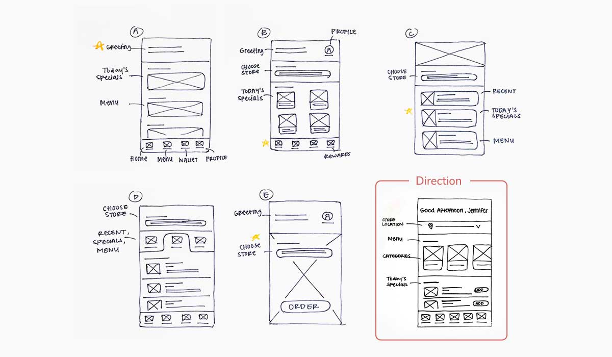
I made a few more iterations for the homepage that will allow busy users to start their ordering process immediately. I included a recently purchased items section to help users make a quick choice by reordering a past item. Categories of the menu are below for users to browse through options and get started from there.
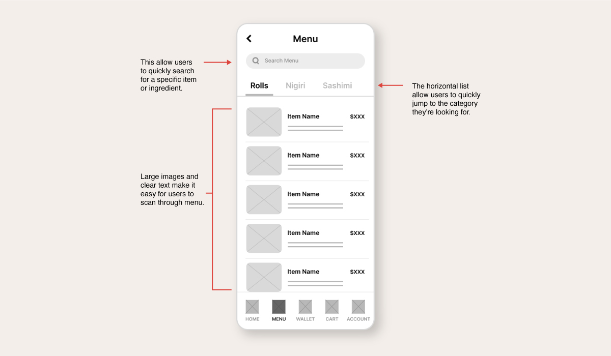
The menu design is made to be minimal and easy to scan for users who have little time to read through every information. So, having large images was a user need that I kept in mind for this design. For quick access to a specific item or ingredient, I included a search bar at the top.
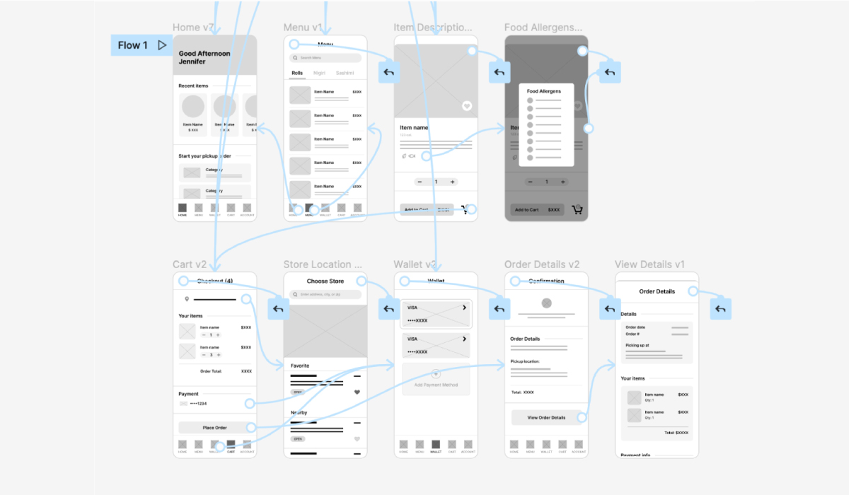
The low-fidelity prototype aims to bring the primary user flow from browsing through the menu to placing an order for pickup.
View the Zaza Sushi's low fidelity prototype.
I conducted two usability studies. The first study helped discover most of the issues with structure and missing features that users encountered from the low-fidelity wireframes and prototype. The second study went over a high-fidelity prototype and found some successful user experiences as well as aspects of the navigation between certain pages that needed refining.
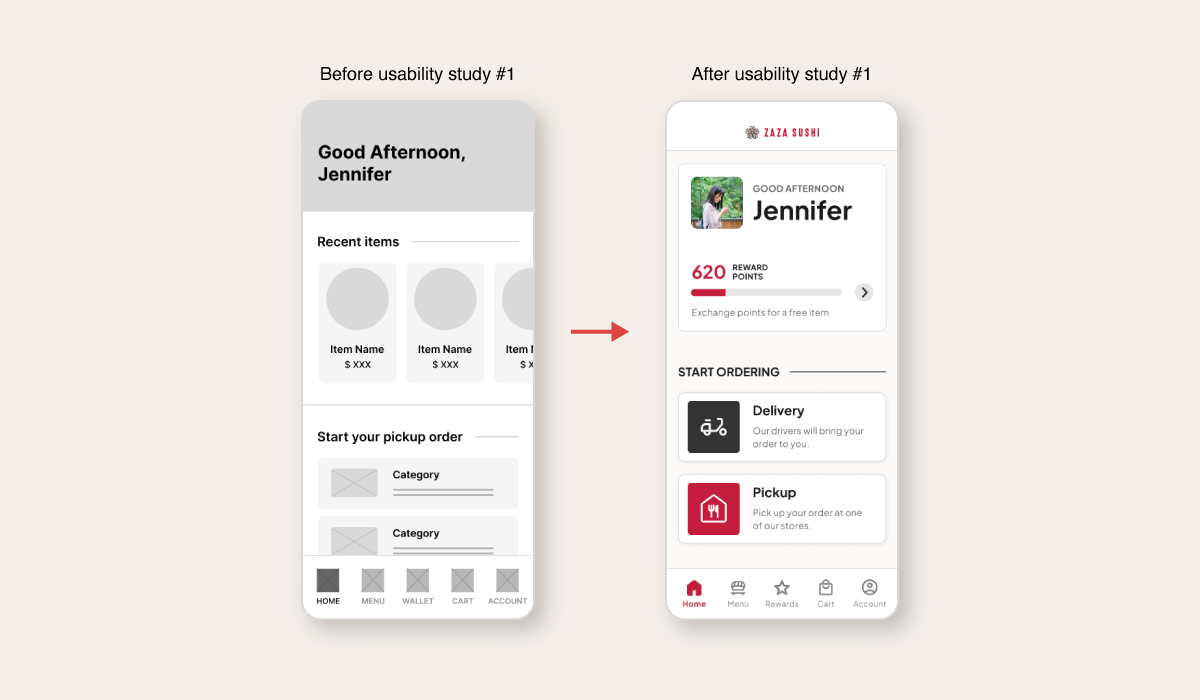
1. Early designs of the home screen displayed recently purchased items and categories of the menu items to allow users to start ordering right away. During the first usability study, users expressed a need for a delivery system and a reason to use the app. I changed the home screen to include a rewards system as an incentive and added a delivery and pickup option to show the service that this app offers.
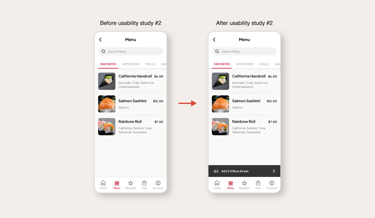
2. The 2nd usability testing revealed that after selecting a delivery address and landing on the menu page, users wanted to see the address they selected. So, I added a section to display it on the menu page.
Interact with the Zaza Sushi's High-Fidelity Prototype: Link to Prototype
Or, view the short video presentation of the app below.
Accessibility Check
Accessibility Check
Accessibility Check
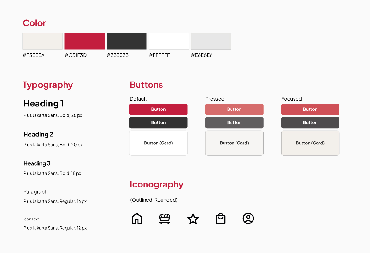
To meet WCAG’s (Web Content Accessibility Guidelines) standards, color and contrast were tested and passed to provide enough contrast between text and backgrounds for users to read content easily. Color was also used to convey information such as indicating a call-to-action button.
Using imagery and icons were intended to avoid using text-heavy content to help users scan through information with ease, especially when using the app in a busy environment.
Navigational cues were used such as labels, search bars, and clear headings to help users understand where they are on each screen.
Iterating the designs to meet user needs helped users successfully complete their order for delivery or pickup with little to no issues in between. A quote from a participant from the usability study: “The ordering process was pretty easy and straightforward. Everything is there and was easy to find.”
Conduct another round of research and usability testing to ensure that user needs are met by most users.
Refine the navigation to become smoother and intuitive and complete other screens that were not part of the main user flow, such as the Sign In/Sign Out screen.