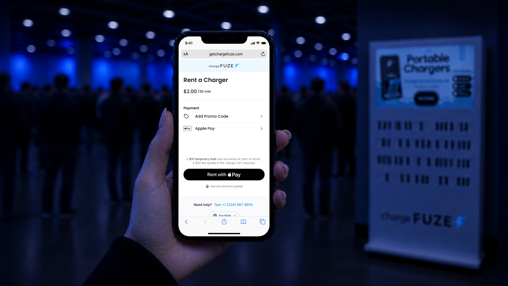
chargeFUZE's mobile checkout was losing more than half the people who reached it. I redesigned the flow and conversion went from 43% to 70%.
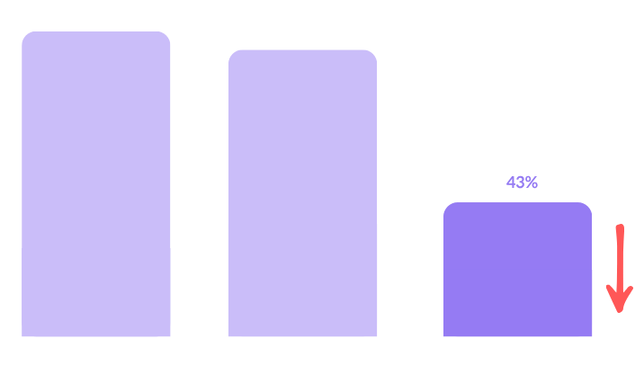
chargeFUZE puts self-service charger rental stations in public places, so people can grab a charge on the go, commuting, at a festival, anywhere a phone is about to die. Users were starting the rental flow, but Mixpanel showed a steep drop-off at checkout. Only 43% of people who reached the final step actually completed a rental. That's a problem for the business, and a letdown for someone who needed a charger right then.
I walked the flow as a first-time user, audited every element on the screen, and looked at how other products handle checkout abandonment.
.png)
The screen was cluttered, but every element on it was there for a reason. I needed to find out which of those a first-time user actually needed in the moment.
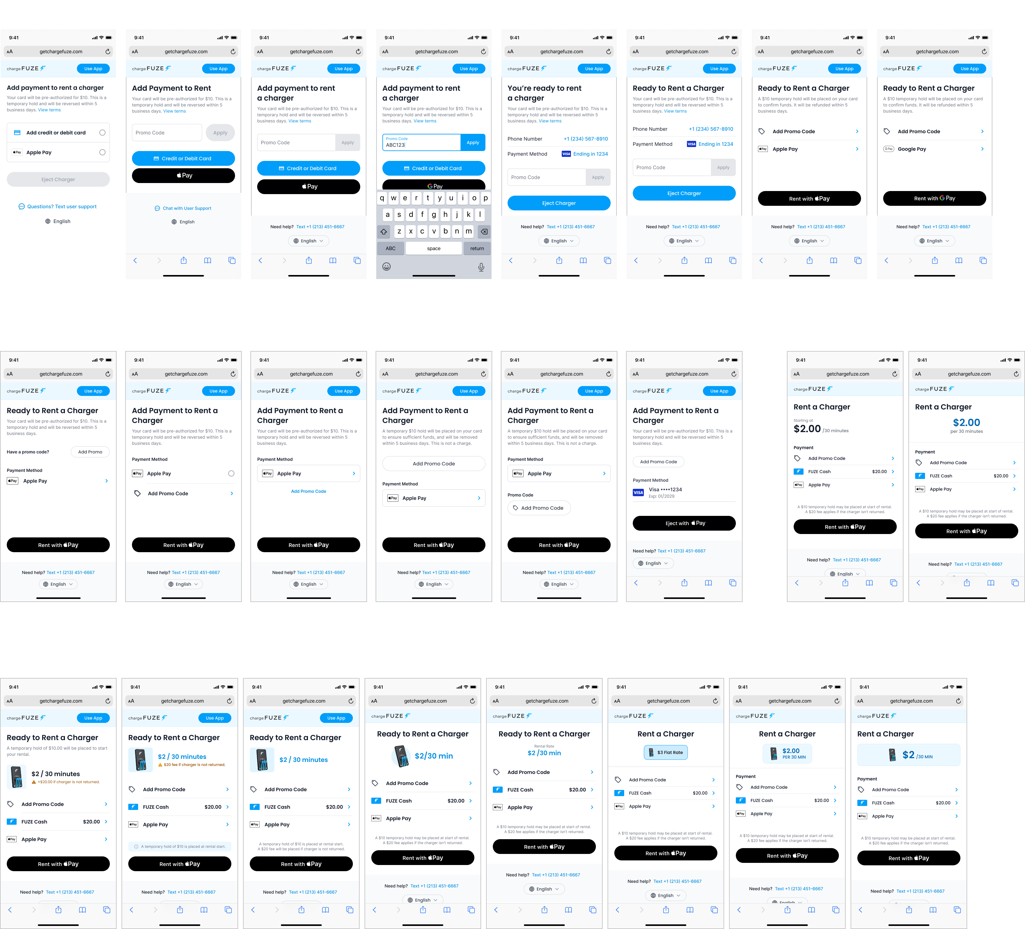
Based on the audit and research, I explored these criteria:
• Express checkout
• Transparent pricing
• Reducing visual clutter
• Reprioritizing secondary content
• Pushing promo to a lower hierarchy
.png)
The rental cost sits at the top of the screen. Before, it lived on the physical station, so people had to look away from their phone to check what they were paying.
Card entry and promo collapse into single lines that open only if you need them, instead of every field competing for attention at once.
The hold is the thing people hesitate on, so it sits directly above the button in one sentence instead of a paragraph with a terms link.
I reviewed the direction with the Product Director and we shipped it with engineering.
The redesign shipped in 2025. Checkout conversion rose from 43% to 70%, and people completed rentals faster.
.png)
Guiding someone to finish their task beat showing them everything we wanted them to know in the moment.
If I kept going, I'd look past the app itself and study the environment people are in when they scan. Public settings introduce noise and distraction that no amount of in-app optimization can fully account for.