.png)
Improving in-park planning, attraction discovery, and Lightning Lane booking through a more streamlined mobile experience.
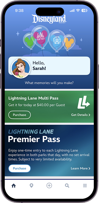
The existing app buried high-priority information under promotional content and fragmented navigation. I redesigned the core in-park experience so guests could access tickets, wait times, and Lightning Lane faster and with less effort.
Public user feedback consistently highlighted frustrations around navigation complexity, information overload, and time-sensitive planning tasks during park visits.
• High-priority information competed with secondary content.
• Planning tasks required excessive navigation steps
• Dense layouts reduced scanability during park navigation
• Guests experienced friction during real-time decision-making.

The core problem was that guests were spending time navigating the app instead of enjoying the park. Every design decision was filtered through one question:
Does this help guests move faster or does it create another step?
This meant deprioritizing promotional content in favor of trip context, consolidating fragmented features into fewer entry points, and preserving Disney's visual identity without letting it compete with functional clarity.
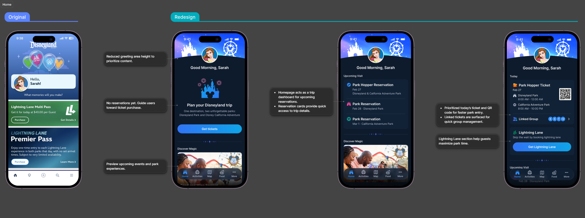
Guests frequently open the app to access tickets, reservations, and planning tools throughout the day. The redesign prioritized trip-related information while reducing non-essential content to improve scanability and faster access to park actions.
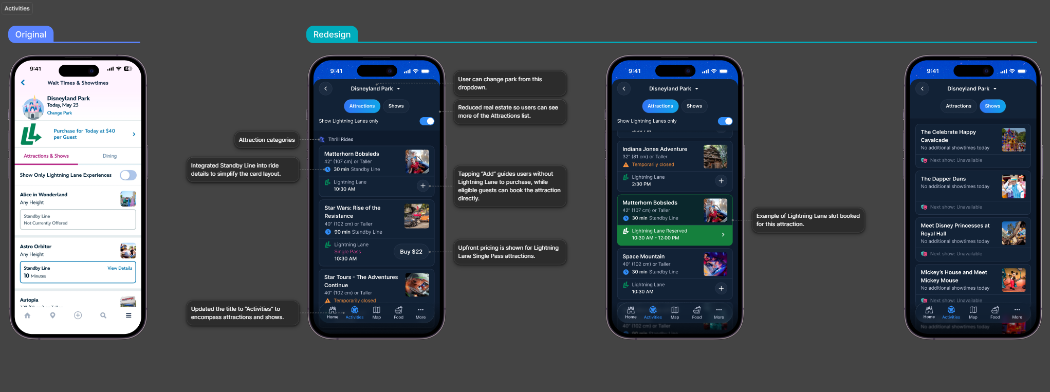
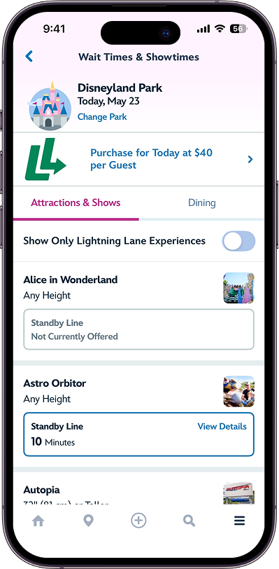
Accessing attractions and Lightning Lane features involved multiple fragmented navigation flows. To simplify the existing Tip Board, Wait Times & Showtimes, and Attractions & Shows experience, I explored consolidating them into a unified “Activities” section with clearer hierarchy, simplified browsing patterns, and a scalable framework for different Lightning Lane use cases.
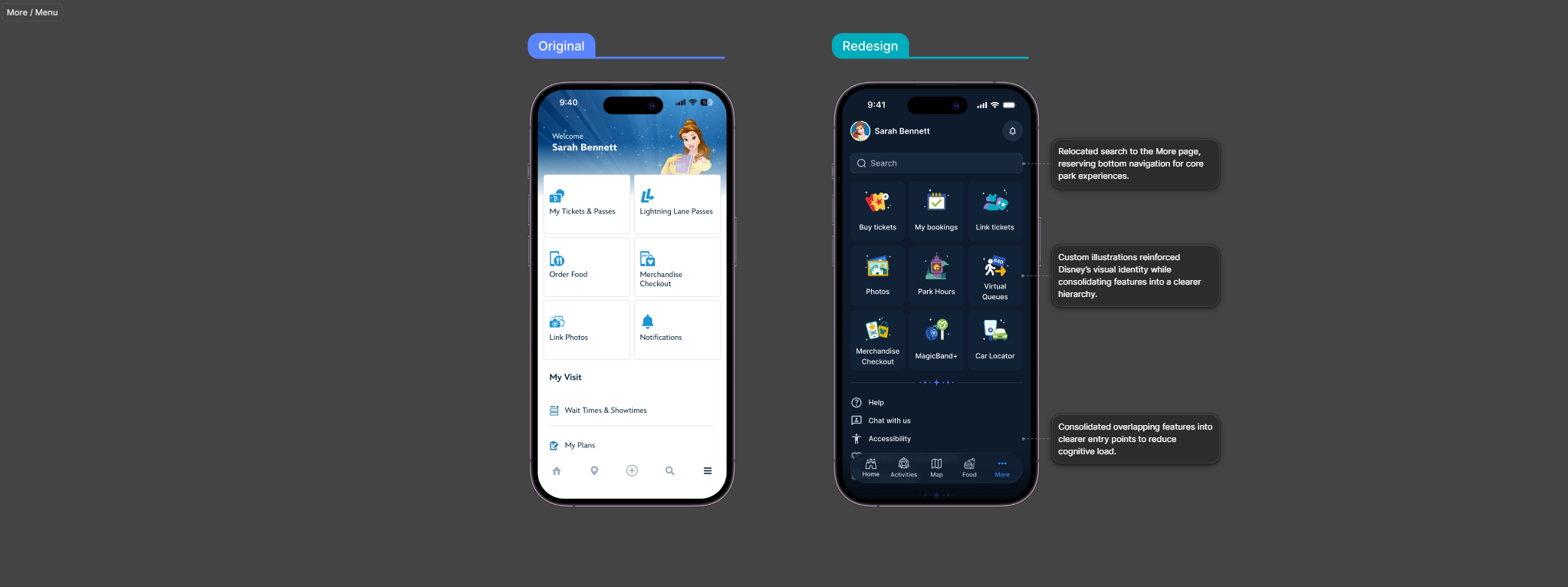
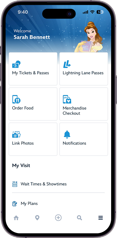
The redesign consolidated overlapping park utilities into a more streamlined menu structure while reserving primary navigation for core in-park experiences. Custom illustrations were introduced to reinforce Disney’s visual identity without overwhelming operational tasks.

This concept was designed to get people to what they need in one or two taps, so guests can enjoy what the park has to offer rather than spend all their time navigate the app.
The hardest part wasn't the visual design, it was deciding what to cut. Every piece of information in the current app exists for a reason, and guests need all of it. The real work was figuring out what they need right now versus what can wait until they go looking for it.